


WildCraft Studio School Website: Redesigned a website for a design focused business with the goals of improving user experience, increasing registration and other bookings, and providing tools for rich visual storytelling. The redesigned site built on a brand update (see that project here). Oversaw user research, content strategy, UX design, and visual design. Since the launch of the site and the updated brand WildCraft has seen a 50% increase in yearly gross revenue.
Role: Design Lead responsible for:
- Visual Design
- UX Design
- User Research and Analytics
Team: Creative Director, Marketing Lead, Director of Public Programs, Developer
Context: WildCraft Studio School offers sophisticated classes that strive “to awaken creativity and deepen an understanding of place, through hands-on experiences in making and learning.”
When I joined the team, WildCraft’s website was difficult to navigate and visually out of date. Users were forced to click through multiple pages to view all of their course options. In order to get information users needed to wade through long, visually unappealing blocks of text with sparse images.
Challenge: Create a website that streamlined the user experience and embodied the brand’s evolving identity, to increase conversions and position WildCraft for sustainable growth.
Problems: Major pain points for the website redesign included: clunky navigation that made it hard to find classes, dated visual design that felt static and uninteresting, and long blocks of text that did not present information in user focused ways.
Goals:
1—Improve navigation and create multiple entry points to registration.
2—Create tools for marketing to feature timely content.
3—Create visually rich editorial style templates to allow WildCraft to explain complex offerings without losing users in dense text.
4—Inform solutions with qual and quant research.
Early feedback to low fidelity wireframes led to a focus on aspirational images of making rather than text descriptions and headlines.
A landing page calendar of upcoming classes and featured content gave users multiple paths to registration or timely marketing pushes.
Integrating screen print inspired illustrations into the background of the site and using a custom hand written font sparingly were a nod to WildCraft’s focus on the handmade by
A scrolling marquee and modal window respond to marketing’s need for promotional messages without detracting from the sophistication of the site.
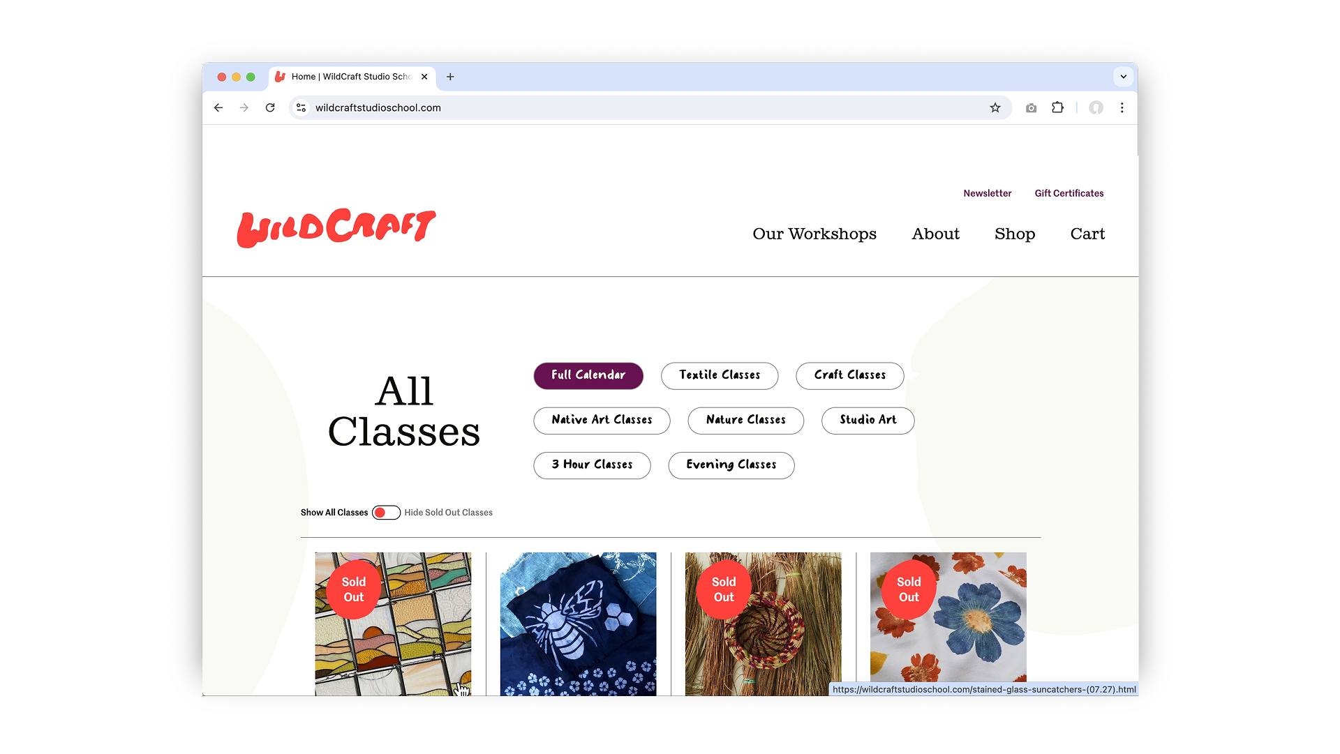
Grouping all classes on a single calendar page that can be filtered by class type made browsing and finding classes much more intuitive.
We initially considered a more complex filtering system, but found that users preferred simple categories, and easily understood how to find the classes they were looking for without greater complexity.
Badges highlight sold out classes and classes that are on sale. Being able to hide all sold out classes means users can find available classes quickly and easily.
A flexible editorial template allowed for rich visual storytelling to replace text heavy pages.
While this modular template was originally developed with About pages in mind, it has become essential for creating landing pages for more complex programming, such as a 5 day retreat, or corporate team building programs.
After launch, analytics revealed that we were losing potential corporate clients between starting to request information and submitting the form.
Response: We simplified the offerings to two choices (“Start a Booking” and “Offerings and Pricing”), and made sure our CTAs were always visible.
We updated the language in response to user interviews revealing that the chance to work with their hands was highly motivating for design teams, and that a simple booking process was important to the folks actually doing the booking.
After launching this update we saw a 74% increase in gross revenue from corporate programming over a 3 year period.
Learnings: Redesigning the WildCraft website reinforced the importance of balancing aesthetics with functionality. User research revealed that visitors valued clarity and ease of navigation, but were less likely to respond to very minimal designs or promotions that did not feel authentic to WildCraft. I focused on integrating touches of the handmade alongside a shift toward a more intuitive structure and streamlined course browsing.
The project also demonstrated the power of strong visual storytelling—high-quality imagery and thoughtful layouts helped translate the immersive, hands-on experience of WildCraft’s classes into a digital format. Additionally, the collaboration between design, development, and marketing underscored the need for flexible systems that could evolve with the organization’s growth. The results showed that a well-researched, user-centered approach can drive both engagement and business outcomes.
Next Steps:
1—Research: Continuing to collect user feedback and track site performance quantitatively will help identify new opportunities to optimize the site further.
2—Automation: While we are somewhat limited by the current platform of the website, I am working to integrate automated journeys into our shopping and marketing experience, as well as working to automate tasks that are currently sapping internal resources.
3—Component Library: I am currently focused on refining and expanding the website’s design system to allow for greater efficiency and consistency in design.